Thursday, December 12, 2019

Believe | Simple Stories

Hello Friends!

 I was fortune to be able to create using the newly released Holiday collection called “Country Christmas” from Simple Stories. This collection is filled with so many gorgeous Bits & Pieces and I used a few to create clusters on my layout.
 Let’s take a look !


 To start my layout I used a piece of paper from the Basics Kit that matches this collection. It is perfect for background papers and allows me to add so many other pattern papers to my page and not have a standard white piece of cardstock.


I added a 1”x12” piece of red & white polka dotted paper to the top and bottom of my page to give some highlights to my layout. I added a larger piece of plaid paper 5x12 to the top and a 1/2” x 12” strip to the bottom.
The green paper was placed at the bottom of the plaid paper to tie up the layout. I added sewing for texture to the paper strips.


The Bits & Pieces for this collection are plenty. I created a cluster of stickers and diecuts on the left of my photo, added another cluster to the bottom of the layout using a border from the Combo Sticker sheet. So many options with these diecuts, it’s unlimited what you can create with them.


I added a title for may layout which is a sticker with the word BELIEVE. I added some dimensional adhesive to the back of the sticker to give it some height on the page.

I hope you enjoyed my layout and could find some inspiration in creating your own layout using the Country Christmas collection.

Come visit us on instagram! Simple Stories or Kristine Davidson

Wednesday, December 11, 2019

Snow Day | Simple Stories


 I'm here today to share a layout I recently created using the Winter Farmhouse collection from Simple Stories.


I wanted to use so many patterned papers from this collection so I decided why not use them in strips. I took a few of my favorite papers and cut them in assorted sizes. What a great way to use many patterns and colors.


This isn’t hard to recreate. You can also do this with leftover or any of your favorite simple stories collections!

Tuesday, December 10, 2019

Grins & Giggles | Simple Stories


Hello Everyone!

It’s Kristine here today to share one of my latest layouts using the So Happy Together Collection. This collection is so perfect for a variety of pages and projects. It contains cute little flowers, word diecuts, colorful houses and so much more. Going to a house warming party soon? Perhaps an anniversary? Or just want to document the love your shared with your family a few weeks ago? All of these topics and more can be documented using this collection. My 12x12 layout is called Grins & Giggles.


My cousin spent the afternoon with her daughter and all they did was laugh and play outside. The most memorable moment of that day was this sweet selfie they took. I love the smile they both have and the laughter they shared together. I started my page with a piece of Green paper from the Basics Kit. I backed it up with a Blue piece of paper from the same Basics Kit and both of these then added to a piece of white cardstock. This created a great base for all those pieces of patterned paper I used.


I had an 6x8 paper pad and used quite a few of the papers included in this collection. I created layers and started embellishing with the Bits and Pieces.


Adding a small die it for my title “grins and Giggles” was perfect for this picture. I wanted to add a few sentences of journaling but decided to keep it simple with two strips of journaling as I usually do.


This was really a fun layabout to created and I absolutely loved creating with this collection. Don’t forget to share your layout using some Simple stories by using the #simplestories and tagging us @simplestories_

Have a great day!

Monday, December 09, 2019

Merry and Bright | Simple Stories

Hello Friends!

I am here to spread a little Cheer with my latest layout called Merry & Bright using the Simple Stories Say Cheese Christmas collection. I absolutely love seeing picture of animals dressed up for the holidays. This little one called Dev is with his favorite human Cabrelle getting ready for the holiday festivities. That look on his face just screams why am I doing this !!!? Right?


This layout is very simple to create and all you need is a few sheets of this gorgeous and festive collection. I used a sheet from the Holly Jolly Simple Basics Collection, which is a must have by the way, and backed up a few pieces of assorted papers in different sizes. I used a piece of white cardstock as my base but any color that matches this collection would be perfect. I added my assorted papers to the base in no random order and that was my background! Simple right?


Once I added my photo I started embellishing the bottom and top left of the layout. I always use dimensional adhesive under my Bits & Pieces to create height and it also allows me to add more layers.


Journaling was added on a small piece of white cardstock and adhered under the top left cluster. My title was left simple using a die cut called Merry & Bright.


You can create this simple layout in no time and you can even add a few more pictures if you'd like.
This collection makes it super easy to create fun pages of you and your pets or something to make you SAY CHEESE!
Come visit Simple Stories and myself on instagram at @SimpleStories_ and @KristineDavidson.

Cheers !

Friday, November 01, 2019

Happy Halloween | Simple Stories

Hello Friends!
It's Kristine here today and I'm sharing a Halloween Layout I created using the Happy Haunting Collection from Simple Stories. This collection contains come great Halloween colors such as black and orange but throw in a little pink and you have a collection that can be used for summer, fall or Halloween layouts. I chose to create a Halloween page. I used a photo of my cousin's painted face for her last Halloween party.

I wanted to add some color on this page and kept it to the orange, black and white colors. I tried not to add pink because I'll keep those elements for another page.

 I started created my layout using a piece of black cardstock. White was also a good option but I wanted more black on my page. I cut a piece of paper 10x10" to fit and then added some orange for color on the top and bottom.  I created some star shapes and added those on my layout using a multitude of colored papers.


I wanted to used multi photos on this page but I only had 1 picture to work with. I printed a 4x6 and then decided why not use the same picture but smaller. I added some dimensional adhesive on the back to add dimension to those photos.


Adding lots of chipboard pieces as well as Bits & Pieces just completes my page. I really can't go without decorating or adding clusters to my page. The little scary cat, the RIP tombstone and some bats in the mix just add lots of texture and dimension as well to my page.


I finished off my page by adding Happy Halloween with the chipboard pieces from this collection. It fits perfectly on the top right of my layout.
To add more details I added some enamel dots and voila! EEK!!

Grab this Spooky collection from your local scrapbook store and enjoy!
Visit us on Social Media @SimpleStories_ and @KristineDavidson

Wednesday, October 30, 2019

EEK! | Simple Stories

 I created this "Creepy" Layout using the Say Cheese Halloween Collection from Simple Stories. The colors and pattern designs in this collection are so perfect for those spooky pictures!


I used the Spooktacular paper for the base of my layout. I could have used a black piece of cardstock but I find that using a piece of paper makes a cohesive page with the other patterns. I then layered some different pieces on both sides of the 6x12" (Orange with Bats) Frankly Frightful paper. You can add a variety of colors on your layout using this collection. This combination was my favorite.

I really couldn't help myself and add a little witch to my layout. I find these to be soooo cute. She was perfect for that space ;)


I added a 3x4 element card to my page. This can be any of the great selection from the Element papers. I used this one because it really went well with my journaling and the photo. I did trace the edges with a black marker to have it blend better with my black details.

I hope you like my page and anxious to create your own Halloween Page! Come visit us on Social Media because we love sharing more Simple Stories pages with you.


Thursday, August 15, 2019

Let's Cruise | Simple Stories

Hello Friends!

Today I'm sharing a layout I created using the Simple Stories Cruisin' Collection. I used a photo of the cruise ship my friend and her Mother in Law took last February. I highlighted the ship, the ports of call and of course the date the cruise was taken.


My background was created with a white piece of cardstock but you could use the gorgeous Simple Basics sheets that come with this collection. I added a few strips of paper in assorted sizes to use more color and texture.

I used a 4x6 photo and mounted it on dimensional adhesive and of course added more on the stickers and diecuts. I didn't want to add to many diecuts around the photo since my photo was the focal point for my layout. Instead of doing clusters around the photo I added the elements on the bottom of my page.
My journaling was created on a piece of white cardstock that I cut in strips to place them on my layout. I was debating on using my own handwriting but I thought typed up would be better.
I added a small cluster of stickers and diecuts on the right of my photo. This can be another small photo if you wish or use a 2x2 piece with an image or title even.
I hope you enjoyed my layout today. This collection is super cute for beach scenes and Cruise Ships!

Find us on Instagram @SimpleStories_ and @KristineDavidson

Supplies Used :
Cruisin' Collection
10636 Collection Kit
10637 Combo Stickers
10651 Bits & Pieces
10652 4x6 Stickers
10655 Enamel Dots
10659 Simple Basics

Wednesday, June 26, 2019

LOVE | Simple Stories

Hello Friends,
I'm here today to share a layout I created using the Simple Stories Heart Collection. This collection is more about celebrating and scrapbooking loved ones we've lost and those we want to cherish in our scrapbooks. I wanted to use this collection to celebrate my niece's sweet face instead. Something different and a bit of different direction with this collection. I tend to do that on many of my projects. I am showing you another way to use this collection in case you love it and don't necessarily want to scrapbook that many pages of loved ones lost.

This layout is called LOVE -
I love her face, the way she makes silly smiles and grimaces and makes me laugh out loud!
I used the SN@P Basics papers for my background along with a white piece of cardstock. I layered all 3 papers to form my background.
I cut up small pieces of paper 1" by 4" from the 6x8 paper pad. This allowed me to use smaller patterns and many different papers from the collection.


Once my background was done, I added the strips of paper, the 3x4 photo and then started layering with flowers and hearts. I scattered the hearts on the paper more on the right of the page than middle.
This just makes it easier on the eye.


Adding the circle LOVE LOVE LOVE from the Bits & Pieces adds more details and enhances the page title.

Of course I added small drops of glimmer glaze to add texture and finished off with some journaling.


Hopefully I gave you a bit of inspiration or something to think about for your next layout.
You can find more projects on our instagram accounts - @SimpleStories_ and @KristineDavidson.

Have a great day friends!

Supplies
Heart Collection -
10517 6x8 Paper Pad
10513 Bits & Pieces
10725 Simple Basics Kit
10512 Chipboard


Wednesday, June 19, 2019

Sweet Smiles | Simple Stories

Hello Friends!

I played with the Oh Happy Day! Collection from Simple Stories this week and excited to show you my layout. The colors for this collection are so bright and vibrant - gorgeous for summer pics! I wanted lots of colors on this page and well maybe I over did it with embellishments cut I couldn't stop! I used a picture of my friends girls enjoying a day outside together. They are the cutest gals and have "sweet smiles!"


I started creating this layout with a white cardstock base. I wanted to add a cut file but wasn't sure where and what I wanted to do so I took this circle one and added the bright pink patterned paper behind it.
I added a piece of yellow paper about 8x12" and sewed the cut file on top of it. I did some messy sewing for this one. I wasn't worried about straight lines.


I added some other papers to the sides of my layout - 3 different ones actually and sewed them as well. Adding some diecuts from the Bits & Pieces package was really easy. I took mostly the flowers and hearts with a few other misc items such as sunglasses,  and the camera. I formed small clusters surrounding my cut file and well maybe went a little crazy with the hearts and enamel dots.
All these gorgeous colors I couldn't stop!


To create the title I used the Sweet and Smile words from the Bits & Pieces package - I was lucky enough to have an extra package and used the S from another word in the package to create Smile(s).
To add some dimension and give it a contrast on the white cut file I used a black brush marker and traced the edges of the words. This gave me a bit of black detail and kind of make the title stand out a bit more. I of course added dimensional adhesive on the back of my words.


Are you ready to get your own Oh Happy Day collection pack? It has so many awesome papers and fun diecuts too.  Hopefully I gave you a bit of inspiration or atleast something to think about for your next layout. You can find more projects on our instagram accounts - @SimpleStories_ and @KristineDavidson.

Have a great day friends!

Supplies
 Oh Happy Day -
10660 Collection Kit
10675 Bits & Pieces
10676 4x6 Stickers
10679 Enamel Dots
10729 Simple Basics Kit

Tuesday, May 07, 2019

Summer Fun | Simple Stories

Hello Friends!

I'm excited to share this perfect summer collection from Simple Stories called "Sunshine & Blue Skies". It is full of cute embellishments such as flip flops, surf boards, palm trees and more! Planning on a vacation in the Caribbean or Hawaii anytime soon? This collection would be fabulous for your TN's, Planners and Scrapbook Pages too!

I created a layout today using 4 photos from my cousins' adventure in Trinidad. Imagine having the luxury of moving to an island for 3 years with your family ... this is exactly what she's doing!
I am so thankful that she gives me permission to use her pics since I haven't seen the sunshine since last ... October maybe! Yes the East Coast is really grey right now.

First I used the Sunshine & Blue Skies Simple Basics Kit. This kit has (6) 12x12 Cardstock pages. It is perfect for using as background papers or card bases and a lot more. I used 2 sheets to create the background on the layout.


I used a few 6x8 sheets to use for layering and added 4 small 2x2.5 inch pictures on a piece of white cardstock. I added dimensional adhesive on the back of the photos to give them a bit of a level on my page.
I added chipboard pieces as well as diecuts on dimensional adhesive surrounding the photos.
Adding several layers using flowers, cameras, surfboard and even little people diecuts!


These little people come in all shapes and sizes and can be added to any layout to add a little extra FUN to your page. They are so cute!

 I hope you enjoyed my layout today and let's see what you create with this beautiful summer collection!

Come join us on Instagram @SimpleStories_ and @KristineDavidson

Supplies Used:
Sunshine & Blue Skies 
10728- Simple Basics Kit
10608- Combo Sticker Sheet
10621- Chipboard
10622 Bits & Pieces
10623 Pool People
10629 6x8 Paper Pad


Thursday, April 04, 2019

April Reveal | Your Next Stamp

It is time for this month's stamp reveal at Your Next Stamp today!!!
We have so many cute stamps with matching dies, gumdrops and a fishy background being released today. It is so exciting when new products are up for grabs.
In order for us to share these new products we are having a BLOG HOP today with the design team members and guests. The hop starts today until April 7th so hop around and check out the amazing cards this team has created. If you'd like to win a Gift Certificate to the store ...keep reading!


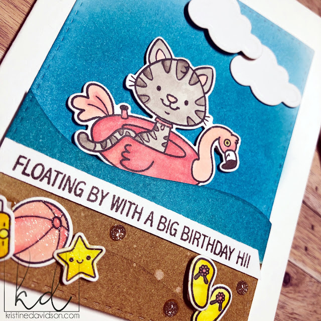
Today I'd like to show you a few cards I created using the NEW PRODUCTS:
Fishy Background
and the Just Keep Floating Stamp Set with Dies.


I first stamped the background image on white Neenah 80lb Solar White Cardstock and then added some Distress ink. I colored by little floating kitties using Copic Markers.
I used the metal dies made for these images and cut them out - no fussy cutting for me!
I then added some dimensional adhesives behind the kitties and floating donuts to create some dimension.
 I stamped the sentiments on black cardstock with versamark and did some heat embossing using white embossing powder. This little background stamp is so versatile and if you wanted to color each individual fishy you could! The kitties are super cute in this set and could be used for so many cards. I have a few already created ;) 


I hope you enjoyed your time here and please come join the other team members on this reveal day!

 Visit the YNS Store to see all of the New Products
Save 20% Off Your entire Purchase!!!! Hurry!


There is also a chance to WIN WIN WIN an awesome PRIZE...
A $25 Gift Certificate to spend at YNS!

All you have to do is leave comments along the hop
to be entered to WIN!


Thanks for hopping along with us!


Wednesday, April 03, 2019

April Preview | Your Next Stamp

It's time for a Sneak Peek of Your Next Stamp's April Release!
I am in love with this release because it has Kitties!!! OMG these are the cutest stamps ever ;)
Kitties sitting in floaties? I mean how cute is that?

Today I am featuring a set called "Just Keep Floating"
Of Course as a cat lover these stamps were purrrfect for me !


Lots of Sneak Peeks are waiting for you at the Your Next Stamp blog!!!
We will be posting a full reveal tomorrow - April 4th 11am EST 
Thanks for visiting and see you again soon!

Supplies Used:
Hills DieSet  / Gumdrops /
Just Keep Floating / Stitched Rectangle Die Set / Puffy Cloud Die Set / 

Tuesday, April 02, 2019

Simple & Sweet | Simple Stories

Hello Friends!

This layout is called Simple & Sweet using the Spring Farmhouse collection. As you know I don't fuss about my titles that much and this layout is no exception. I used a diecut from the Bits & Pieces and found one that would be perfect for my niece's attitude and simple pleasures. If you ever feel stuck with a title perhaps look thru those diecuts and pick one that you can relate with. You can always emphasize a title by adding dimensional adhesive or surrounding it with flowers or other embellishments.


I started my base with an Elmwood background from the SN@P! Basics Paper Pack. If you don't have this collection in your stash -- go buy one! It is a must have. I wanted this layout to have layers and have of those gorgeous 6x8 papers. I love the smaller paper patterns because they allow me to use small photos and they don't overcrowd my page or photos. Does that make sense? I also wanted to mat some of those papers and I used the Simple Basics Kit that match the Simple Farmhouse collection beautifully. 


The Simple Basics Kit includes solid colored cardstock papers that can be used for cards, base colors on a layout and so much more. I used these papers to mat my patterned papers. You can see on this picture that I have them matted in assorted colors. I love that little extra pop of color. Cute right?

Adding those solid colors behind my patterns added some extra color on my page and made them visually pleasing. Try something new today! Maybe you have left over cardstock or solid colored papers that you can use on your next layout. Give it a try! Visit Us on Instagram @SimpleStories_ and @KristineDavidson for more projects using Simple Stories.

Chow for Now!


Copyright © Kristine Davidson. All Rights Reserved.
Blogger Template by The October Studio