Wednesday, August 30, 2017

Giveaway | Jillibean Soup

Jillibean Soup is hosting a giveaway on Instagram !
This is your chance to WIN an awesome prize pack containing a Day2Day Planner! 


Good Luck!

Monday, August 28, 2017

Glow Learn Discover | Simple Stories

I am here to share my second layouts using the NEW Simple Stories Simple Set OLD SCHOOL. It was perfect for a few recent photo of my nephew being silly and excited to go back to school.   
This layout is called Grow Learn Discover.

I used the 4x6 journal element and cut it up to create my title. No hard decisions or doubts about a title. Nice and Easy! The one thing I really don't fuss over too much is a title. I usually find inspiration from a sticker or diecut from the kit. This was no exception. 


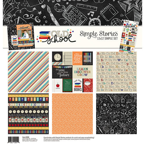
As you can see from the element sheet below - I cut out the clock, Used a 3x4 card to add details to my page.


This is a simple set collection and you get 2 sheets of 3 papers and a sticker sheet.
So you make the kit last by using some elements from one single sheet! GENIUS! Not really but it does help add details to your layout ;)


Simple Stories - Old School Collection - 12 x 12 Collection Kit

from: Scrapbook.com


Sunday, August 27, 2017

Back 2 School | Simple Stories

It was my turn on the Simple Stories blog yesterday and I just wanted to share my projects with you today.
I created 2 layouts using the OLD SCHOOL collection and this first layout is called Back 2 School.

Time for my niece to head off to grade 9. I still can't believe she's 14 and will probably be driving a card in 2 years. OYE!


This layout was created on a 12x12 piece of black cardstock and I wanted to had some white. Instead of using white as my base I layered it with a patterned paper and the black cardstock. I find it breaks it up as I used some neutral colors for my die cuts. I still added dimensional adhesive and created my layers.

 
I still have a few pieces of scrap paper left from this collection - enough to create a card or two for those teachers ;)

I hope you feel inspired to create today and perhaps we'll see your " Old School " layouts on social media! Tag us @SimpleStories_ and of course you can come follow me @KristineDavidson


Simple Stories - Old School Collection - 12 x 12 Collection Kit

from: Scrapbook.com
 
 I will be sharing my second layout with you tomorrow ;) Stay Tuned!

Saturday, August 26, 2017

Better Together | Jillibean Soup

A recent card I created for Jillibean Soup using some Distress Ink, Stamps, and Glossy Accent. I had a fun time creating this card. I first did my background by using my distess ink for watercolor, layered a few times drying between layers. I added some donuts and stamped the coffee mug on another piece of cardstock. I cut out the cup and added adhesive on the back to give it dimension.
SO FUN!!


Supplies:
Jillibean Soup
Stamp Set: Coffee & Donuts;
Shaker Card: Square;

Others: Distress Ink, Momento Ink, Glossy Accent, White Cardstock;

 For More great layouts from the Design Team Visit Bean Talk!


Friday, August 25, 2017

Happy Birthday | Jillibean Soup

Sharing a stamped birthday card I created for Jillibean Soup. Something very easy and fits into Stamping 101. Ink all over with flower stamp ;)
I did some heat embossing for the Happy Birthday and called it a card ;)


Supplies:
Jillibean Soup
Stamp Set:  Saffron Yellow Pepper Soup
Shaker Clear Stamp Set: Rock Star
Sequins: Orange Tangerine
Others: Distress Ink, Embossing Powder


 For More great layouts from the Design Team Visit Bean Talk!

Thursday, August 24, 2017

Friends | Jillibean Soup

So Enjoying this stamping process. It has really given me inspiration and the confidence to experiment with new mediums. I was usually afraid or timid or always said " I can't Stamp " but I gave it a go and loving the process !  I used some Jillibean Soup Stamps from the Handwritten Sentiment pack and used some Distress Ink for Water coloring my background. I used a lawn fawn stitched border die for the rectangle and placed some dimensional adhesive on the back to place that on my card base. I did some heat embossing for the word ' friends ' and added some white paint splatters, sequins and more black paint splats.

Hope you like and also maybe you haven't stamped or even tried it yet?
I say GO FOR IT!

Need some inspiration? Check out You Tube for Laura Bassen, Kristina Werner and even Kelly Latevola . Amazing designers. ;) 


Supplies:
Jillibean Soup
Clear Stamp Set: Handwritten Sentiments
Shaker Fillers: Birthday;

Others: Embossing Powder, Distress Ink, Versafine Black Onyx, Glimmer Glaze, Color Shine, Glossy Accent;


Saturday, August 19, 2017

Summer Days | Simple Stories


Hello Friends!

I'm sharing 2 layouts with you today that I created using the NEW Summer Days collection from Simple Stories. This collection is filled with awesome images such as swimsuits, bikinis, pineapples, snow cones, VW vans, flowers, sunshine and so much more!

I am lucky to have a cousin that lives in the beautiful island of Trinidad and she was kind enough to " lend" me her photos of her cute boys playing at the beach.

My first layout is called SUMMER
This is a gorgeous beach pic of the boys playing with their beach toys and enjoying the beautiful white sand and sunshine.  I wanted to create a layout using tons of paper and layers were the way to go. I have almost every single piece of paper from this collection on this page!
It's fun to cut up pieces and just keep adding and adding. You'll see a close up of my layers a few pictures down.


Layering with embellishments is nothing new for me, as you probably know if you have followed Simple Stories the past few years. I enjoy taking pieces of die cuts, chipboard with some stickers and adding dimensional adhesives. I added brads in my cluster on this page which I really like.It's like an enamel dot but bigger! 


Here is a close up photos of some of the layers of paper I created on my layout. It's a great way to add dimension, color, and of course use up some paper scraps.


My second layout is a grid format.
If you find yourself stuck or unsure of what to create why not try a grid layout ? It's really a simple page which used lots of embellishments, 4x4 journal elements and as many pictures as you need.
I cut my pieces of paper to fit 3.75" x 3.75" to give me a nice white mat between each box. I decorated each individually to make a small layout maybe? A Little 3x3 layout on each square. Some are decorated more than others but overall each little square finishes a larger layout. I really enjoy creating these pages. They are probably one of my favorites. 


Here are a few more pictures -
More details include dimensional adhesive, some enamel dots, and I added some glaze on top of a few details. Just to add a little extra.
Yes that sunshine has some strand of Archie's hair. It never fails! Cat furr it is!


I hope you enjoyed my layouts today!
These little diecuts make me want to put on my bikini (LOL) and head to the beach for some sun, sand, and watch the surfers which drinking my pineapple juice ;)
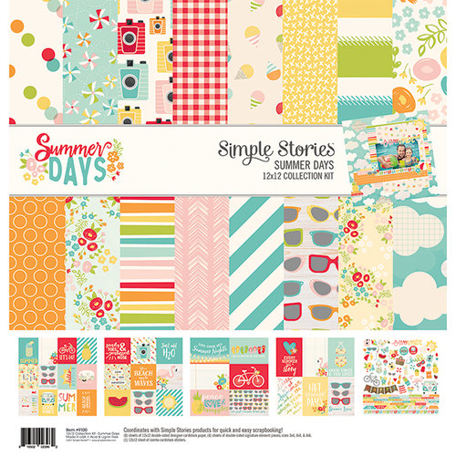

Simple Stories - Summer Days Collection - 12 x 12 Collection Kit
from: Scrapbook.com
 
 
Copyright © Kristine Davidson. All Rights Reserved.
Blogger Template by The October Studio